Content Strategy, UX Design and Copywriting for a Convention Webpage
CDA Presents The Art and Science of Dentistry is CDA’s flagship dental convention that brings together more than 15,000 attendees, industry-leading speakers and exhibitors each year for a weekend of learning, networking and fun activities.
Project: Redesign the landing and attendee pages for the convention
Client: California Dental Association
Discipline: UX Design, Content Strategy, Copywriting
The Problem
It was almost time to launch registration and the Meetings and Convention team thought the convention’s landing and attendee web pages could use updates. They reached out to the marketing team asking for our help reimagining the way we use these web pages to connect and communicate with users. As the strategist for our web and multimedia content, I was tasked with giving the web pages a more engaging design and better user experience.
I jumped into a kickoff meeting with the M&C and identified the following paint points:
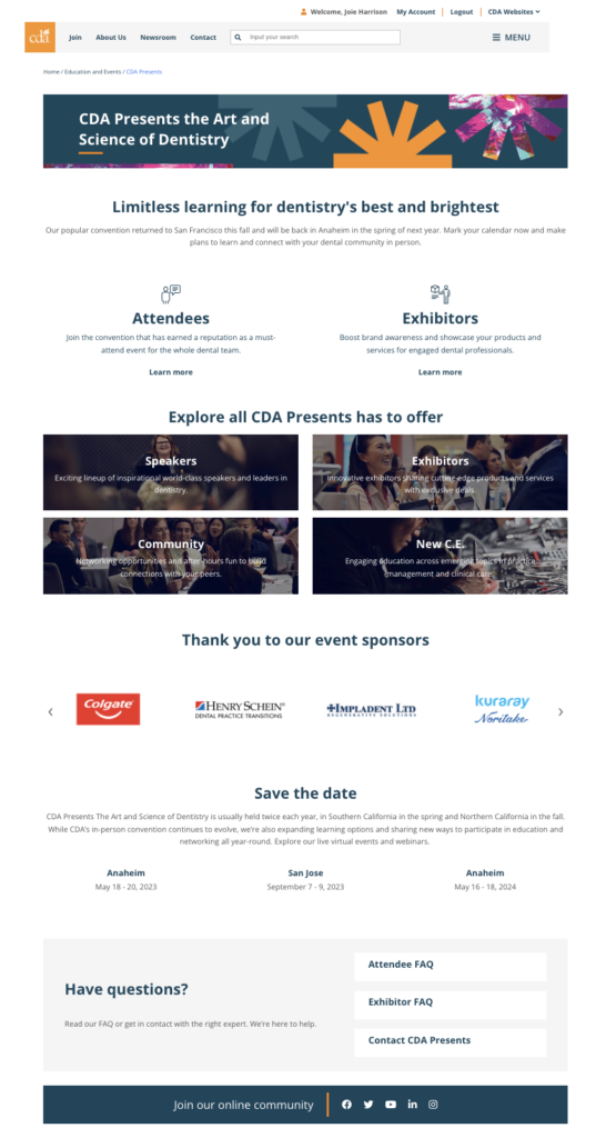
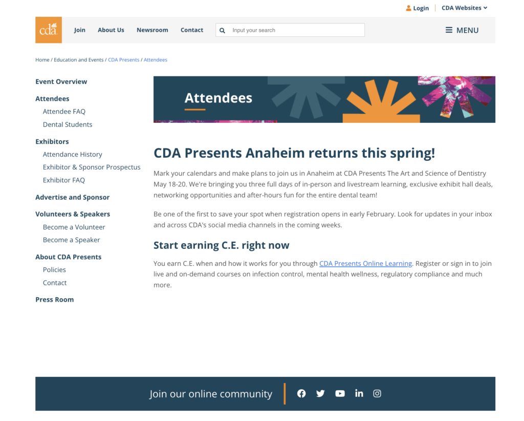
Click image to enlarge
User Pain Points:
- Users do not know how to register for the convention or book accommodations through the website.
- It’s hard to find details about courses, events, speakers and other general information about the convention.
Business Pain Points:
- The client believed both web pages were a “dead end” that lacked a clear and strategic workflow to guide users through their next steps.
- The pages’ lack of information failed to showcase the value of the convention to potential attendees.
- The pages were “dull” and did not feature engaging content to capture the users’ attention.
The Scope
I worked as the content strategist, copywriter and UX designer on this project and collaborated with the Meetings and Convention team, UI lead and marketing coordinator to redesign the webpages ahead of the registration launch.
Goals:
- Develop a user-friendly workflow that makes it easier to register, view courses and book accommodations.
- Find areas to highlight and provide more detailed information about the convention’s offerings.
- Include more pictures, colorful elements and engaging visuals to create a dynamic design layout.
Challenges:
- The redesign was taking place as the Meetings and Convention team was finalizing details for the convention. This made it difficult to know what information would or wouldn’t be available in time for the launch, thus affecting and information architect during the wireframe process.
- The site’s CMS (DNN Software) had limited editing capabilities which hindered bigger design and workflow aspirations.
The Target Users
I met with the Meeting and Conventions team to learn more about their dissatisfaction with the web pages and review attendee feedback from past conventions. After meeting with them, I was able to identify the user and business pain points (previously addressed) which helped shape the following personas and later informed the design.


An established practice owner is interested in attending the convention for the first time. She wants to bring her dental assistants and hygienists along and is looking for more information about continuing education opportunities for team members.
An associate dentist who has not attended the convention in person since the company began offering virtual learning options in 2020. He enjoys the convenience of tuning into the virtual classes from home and is undecided about joining his colleagues and returning in person for the next convention.
A newly retired dentist who recently sold her practice attends the convention every year, but would previously have her office manager handle her registration and book her accommodations on her behalf. This is her first time navigating the website on her own.
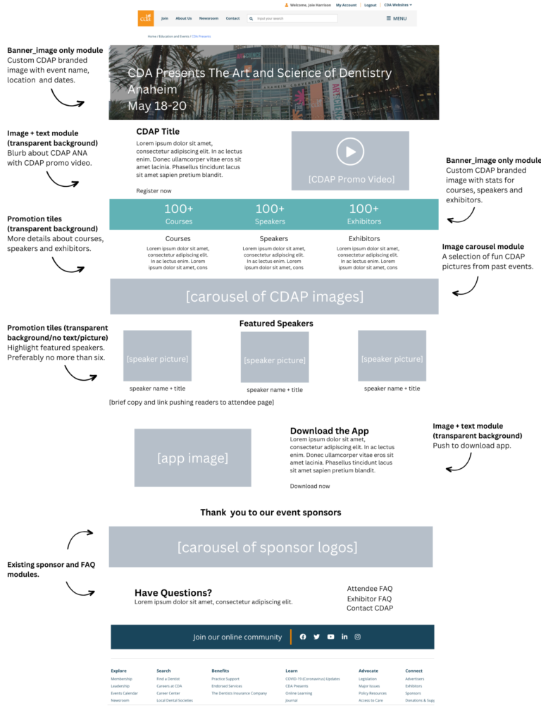
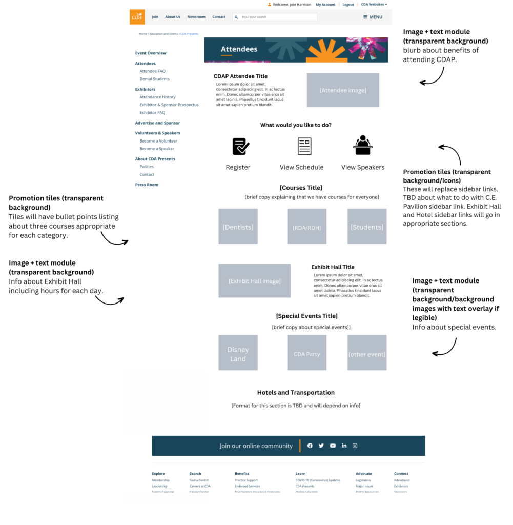
The Wireframes
From the personas, I was able to determine three key areas to focus on for the updates: (1) The value of the in-person experience, (2) the ease of registering, planning and booking accommodations through the site, (3) the various education offerings to choose from. I then began designing the pages via lo-fi wireframes. This is the stage where I also began shaping the information architecture of the pages.
The Final Product
After reviewing the wireframes and copy with M&C team, I teamed up with our UI lead to implement the updates on the website. On the redesigned pages, you can see the solutions for the initial pain points.
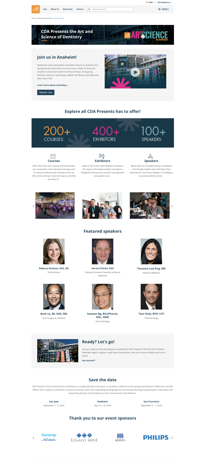
2022 Landing Page Update
2025 Landing Page Update
- A registration button that was missing in the previous page layout.
- A promotional video at the top of the page to generate excitement.
- A link pushing users to the Attendee page to learn more about course offerings, special events and booking accommodations.
- A banner that offers a glance of the number of course options, speakers and exhibitors at the convention.
- A carousel of pictures from past conventions.
- A section to highlight featured speakers.
- Another link to the Attendee page to learn more about special events and booking accommodations.
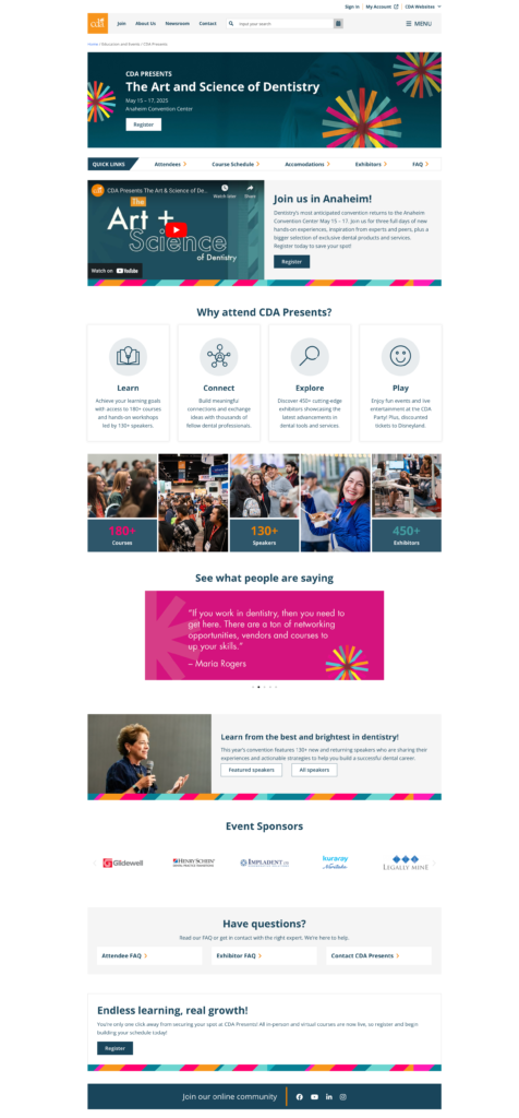
I noticed opportunities to update the landing page again in 2025. I teamed up with the web and design teams to implement the following changes:
- A larger and more dynamic banner with a registration buttons for easy and quick access to the registration portal.
- A navigation link at the top of the page that brought the most sought after links to the forefront.
- Updated language that further emphasized the convention’s offerings.
- Testimonials from past attendees.
- With the addition of several new featured speakers, I decided to move that section to its own page.
- A module with a registration button at the bottom of the page so viewers won’t have to scroll back to the top of the page to register.
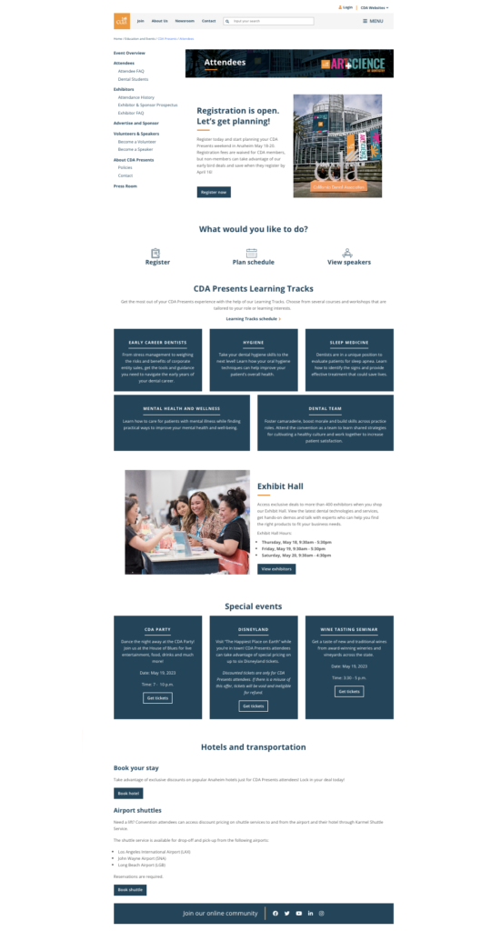
Attendee Page Updates:
- Icons and quick links at the top of the page that guide users to actionable next steps: Register, Plan schedule, View speakers, Book hotel.
- A section to introduce Learning Tracks: a selection of courses and workshops that have been tailored to fit an attendees role or learning interests.
- A dedicated space for the Exhibit Hall, one of the main attractions of the convention, complete with operation days and hours.
- A section to highlight special events with links to register for each. This section also includes special offers for nearby venues and amusement parks exclusively for convention attendees.
- Information and direct links to book hotels and airport shuttles.
The Outcome
The M&C team and marketing leads loved the web page redesigns and agreed the updates went above and beyond to mitigate user and business pain points. Along with other initiatives, including an email marketing campaign that I led, the web page redesigns helped boost attendance for our spring meeting by 111% and our fall meeting by 58% in 2022.

