Handshake App
Handshake is a fictional project management and payments app designed for freelancers and business owners. The app offers users a seamless way to collaborate on projects, track billing hours, and process payments in one place.
This case study is my final project for the UX Writing Certification I earned through the UX Content Collective.
- Project: Write the UX copy for the Handshake app.
- Company: Handshake, a fictional company created by UX Content Collective
- Disciplines: UX Writing, UI Design, Brand Strategy, Copywriting, Voice & Tone Development
The Problem
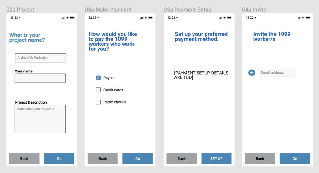
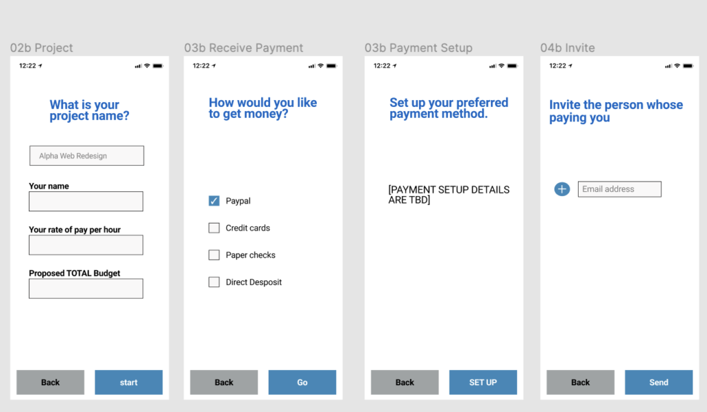
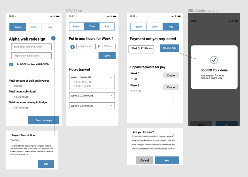
The designer created a mockup for what we have so far of the Handshake app. The mockup includes copy drafted by the designer, but she has asked me to review, edit and develop copy that better reflects Handshake’s voice and advise on minor UI design modifications that could enhance the user experience. We need to complete the edits ahead of the design review with the Head of User Experience and the VP of Product for Handshake, so bigger design changes will have to wait.
The Scope
I worked as the UX writer on this project and collaborated with the UI designer and UX researcher to get the Handshake app user-ready ahead of the review meeting.
Goals:
- Establish a brand voice for the Handshake app that resonates with our target users.
- Draft clear and concise UI copy for interactions, components, tasks and onboarding concepts.
Challenges:
The mockup had design flaws that interfered with establishing a better workflow; however, there was not enough time to address these design flaws ahead of the meeting, so I had to find ways to work around them and make note to revisit them before the next review.
The Target Users
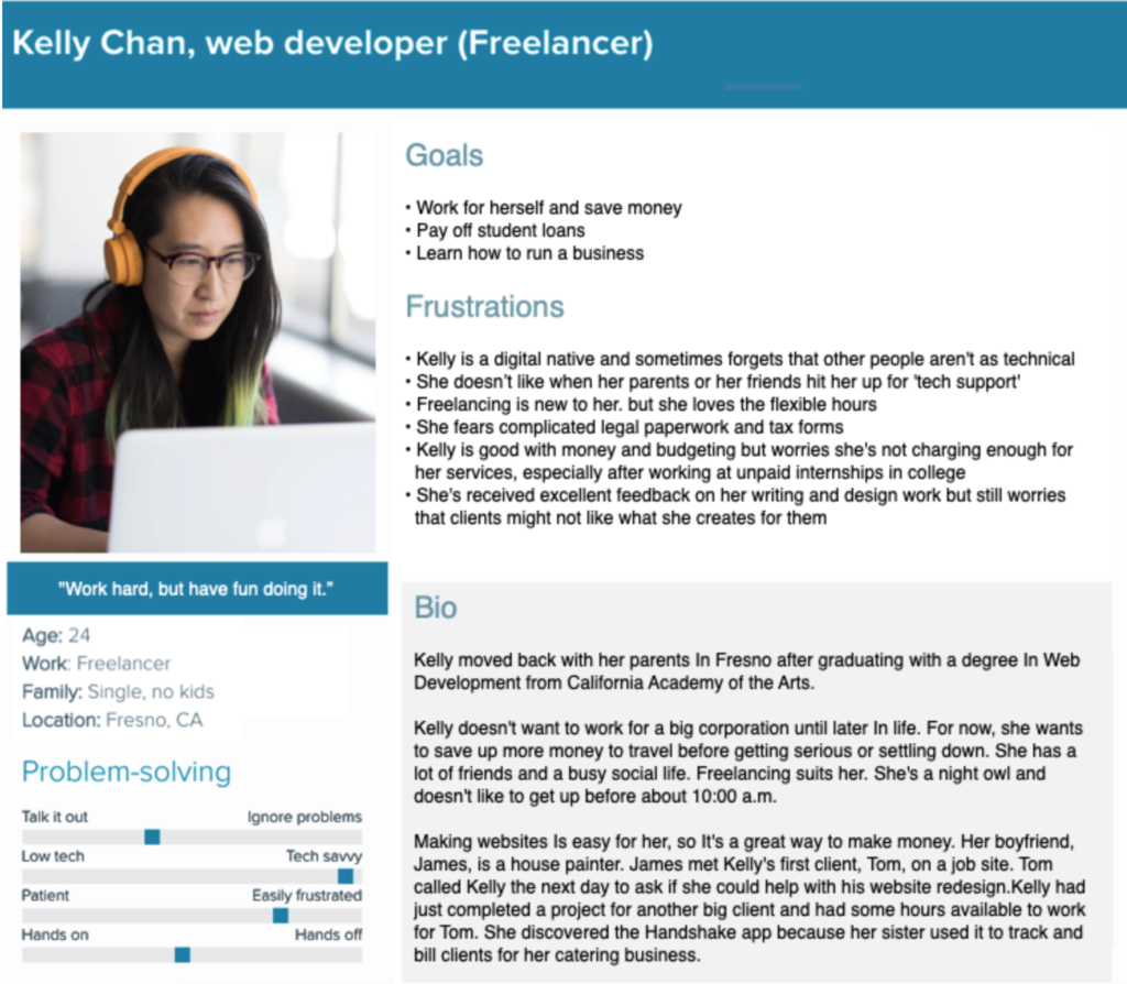
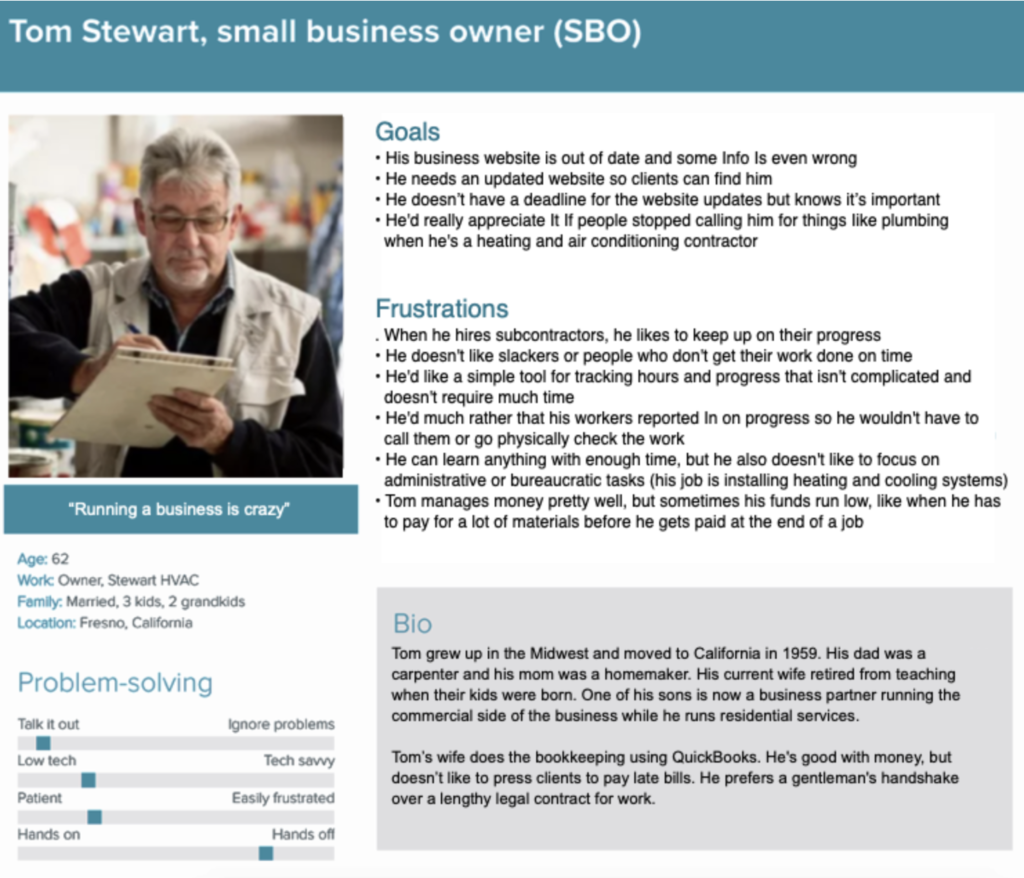
I collaborated with the UX researcher to define our target users and determine how, when and why they would use the Handshake app. Through our research we were able to develop two personas that gave us more insight into their lives and helped inform my writing choices.
We created Kelly Chan, a freelance web developer, and Tom Stewart, a small business owner who hired Kelly to redesign his website.
The Voice & Tone
Once we identified our target users and their needs, I expanded on the persona research to define a meaningful product voice that resonated with their collaboration and working styles.
Handshake is clear and informative, trustworthy, and friendly.
Clear & Informative
Trustworthy
Friendly
Avoid vague statements or questions that don’t clearly define the action the user is taking, what happens after they complete that action or provide next steps.
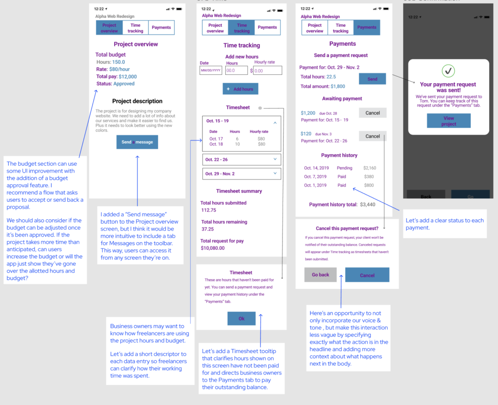
DO: Cancel this payment request? Canceled payment requests will appear on the Time tracking page as a timesheet that has not been submitted.
DON’T: Are you sure? This cannot be undone.
Use language that reassures users their projects and personal information is safe when using Handshake.
DO: Make easy and secure transactions through the “Payments” tab.
DON’T: Just enter your account number and leave the rest up to us!
Use a warm tone that offers users a welcoming experience throughout the app.
DO: Have a question? We’re here to help.
DON’T: Error. Try again.
To help the team adopt this voice, I developed a style guide with preferred terminology and grammatical rules to use when writing for the app.
The Copy & Design
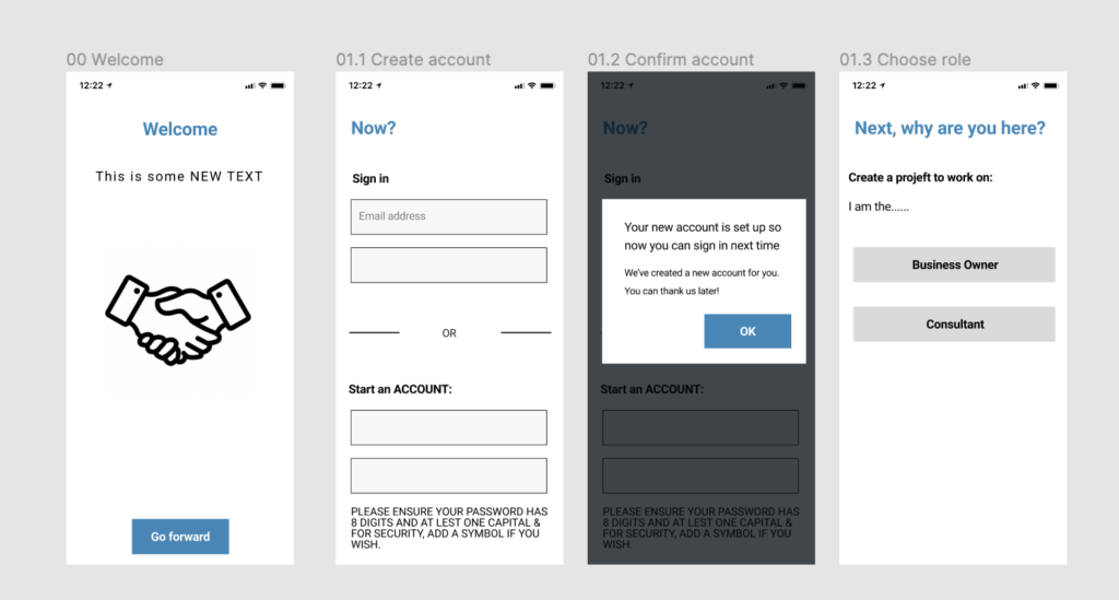
With a defined voice and better user understanding, I was now ready to refine our high-fidelity mockups and make them user ready.
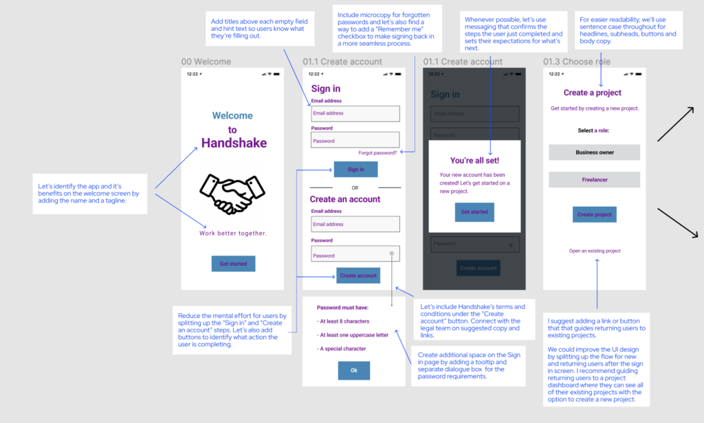
Sign in
What I did: For the Welcome screen, I implemented copy that clearly defined the app and its benefits. I applied microcopy and hint text throughout the sign-in process to help users successfully and confidently proceed with logging in or creating a new account. I also found several opportunities to implement Handshake’s voice and foster a friendly, informative introduction with users.
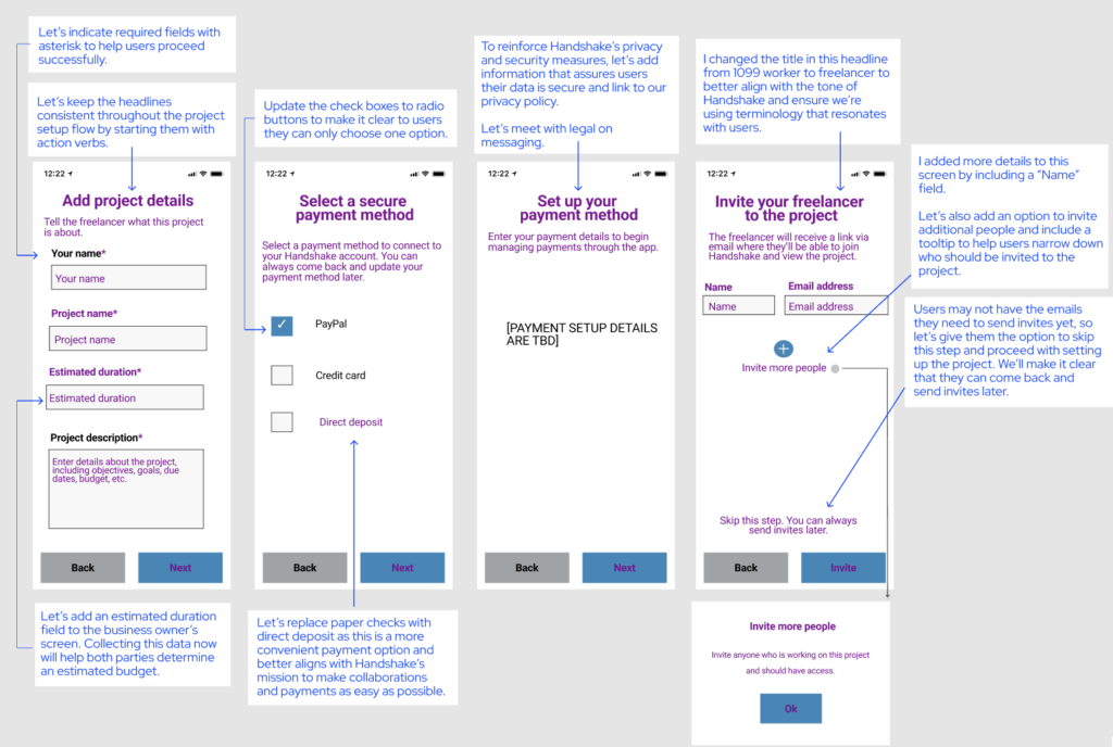
Onboarding
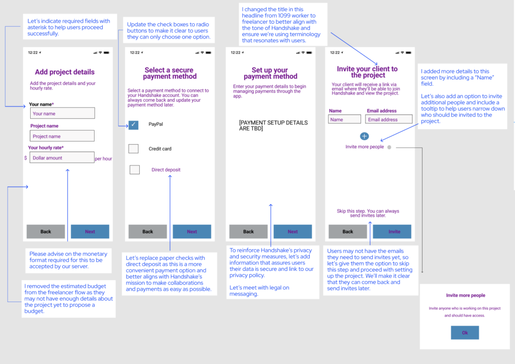
What I did: I found opportunities to ease user friction by refining the copy with terminology that resonates with our target audience, identifying required fields and proposing new fields to ensure Handshake has the necessary data to enhance the ongoing user experience.
I also recommended adding the option to skip and return to invites later as users may not have the necessary emails and information during this step.
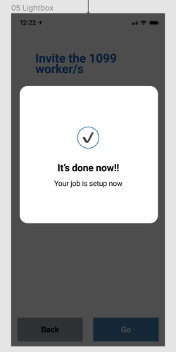
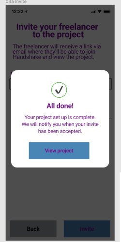
For the confirmation screen, I flexed to an exciting tone to celebrate users completing initial steps and set their expectations by clearly outlining what comes next.
Ongoing use
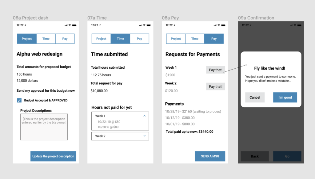
What I did: I added more microcopy, tooltips and hint texts to help users better navigate through the app, while finding places to weave in Handshake’s voice and style.
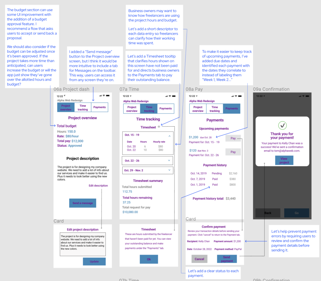
I also recommended opportunities to improve the UI design with the addition of a budget approval feature. The budget approval process is unclear with the current design and we need more context on what happens when a user approves or denies a budget. We should also consider if the budget can be changed once it’s approved and what happens if a project goes over budget.
I refined details on the Payments page to help prevent payment errors and add an extra layer of security. This includes adding a payment confirmation feature that requires users to confirm the payment details before sending. I also added due dates and labeled each payment with the specific work weeks they correlate to.
The Outcome
My UX Content Collective instructor deemed the mockups and copy user ready. I received a 95% on my final project with tips to include more description hint text and error messages, both of which I went back and applied to the mockup. I received praise for my design improvements, implementation of microcopy to fill in gaps and provide more content, and for developing a voice for Handshake that kept the user experience both casual and professional.
